magazine front cover

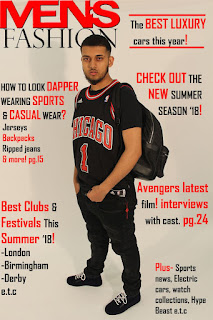
1) Save your finished Photoshop magazine cover as a JPEG image and upload it to your evaluation blogpost.
2) Write an evaluation of your work: have you succeeded in your brief to create a new, original edition of an existing magazine? i have succeeded in creating a new, original edition of "MensFashion" as I've got some headings which are involved in most editions, such as "Latest Clothing".
4) What is the strongest aspect of your work? the strongest aspect of my cover is the concept of how to dress in the heat of summer 2018. Also, to look stylish and to stand out in your sports gear.
5) What is the weakest aspect of your Photoshop magazine cover? not centralising the image as it doesn't focus on the eyes whereas, the original editions all focus on the eyes above the central point on the right.
6) What would you do differently if you completed this assignment again? next time i will make sure all text is lined up side by side to demonstrate how professional the magazine cover is. also, im going to use correct features of a magazine cover such as not adding page numbers, dashes, "e.t.c" and others. further more, i'll need better headings which will make the viewer want to read the magazine.
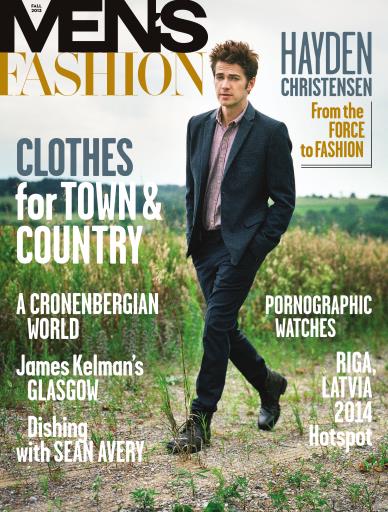
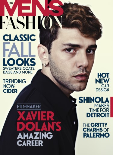
3) Put your cover alongside a couple of genuine covers of your chosen magazine. How professional is your work alongside genuine examples?


Comments
Post a Comment